Build a Strong Brand (From Identity to Daily Use)
Turn your brand choices into a system your team can use every day.
Understand the Basics of Branding
Branding is the set of choices that shapes how people see and recall a business. It includes your visuals, messages, service, and the feelings people link to your work. A strong brand helps customers know what you offer and what to expect. That recognition can build trust and support repeat sales.
A logo alone cannot do that work. People meet your brand on your site, in emails, through products, and during service. When those moments feel connected, your business is easier to remember. If you are learning how to make a branding system, begin with the promise you want people to recall.
Write down who you serve, what need you meet, and why your offer stands apart. Add three traits that should shape the experience. A local bike shop might aim to feel skilled, friendly, and welcoming to new riders. Those traits give later choices a clear test.
- What does your business help people do?
- Who needs that help most?
- What should customers remember after each interaction?
- Which traits should show up across the whole business?
Keep your answers specific. “Helpful” could describe almost any company. “Patient advice for first-time home bakers” gives writers and designers a better direction. Use real customer questions to test whether your promise feels true.
Choose the Key Elements of Your Brand
Effective branding joins words and visuals into one system. Its main visual parts are your logo, colors, and type styles. Brand messaging explains your value and shows how you speak. Each part should fit your audience and support the same traits.
Start with a logo that works at large and small sizes. A wide version may suit a site header, while a simple mark may fit a social profile. Ask for common file types, such as SVG for sharp web use and PNG for clear backgrounds. Check each version in black and white, too.
Choose a small color set with a clear role for each shade. One main color, an accent, and two neutral shades may be enough. Test text on light and dark backgrounds so it stays easy to read. Audience fit and legibility matter more than broad claims about color meaning.
Pick type styles that read well on screens and in print. One typeface for headings and another for body copy can be enough. Set a simple size scale for headings, labels, and body text. Then note your key message, voice, and words to use or avoid.
Keep the system focused. Too many colors, fonts, and logo versions make each new design harder to match. Ask a few customers or staff members what they notice first. Their answers can reveal unclear choices early.
Create Branding Guidelines That Help
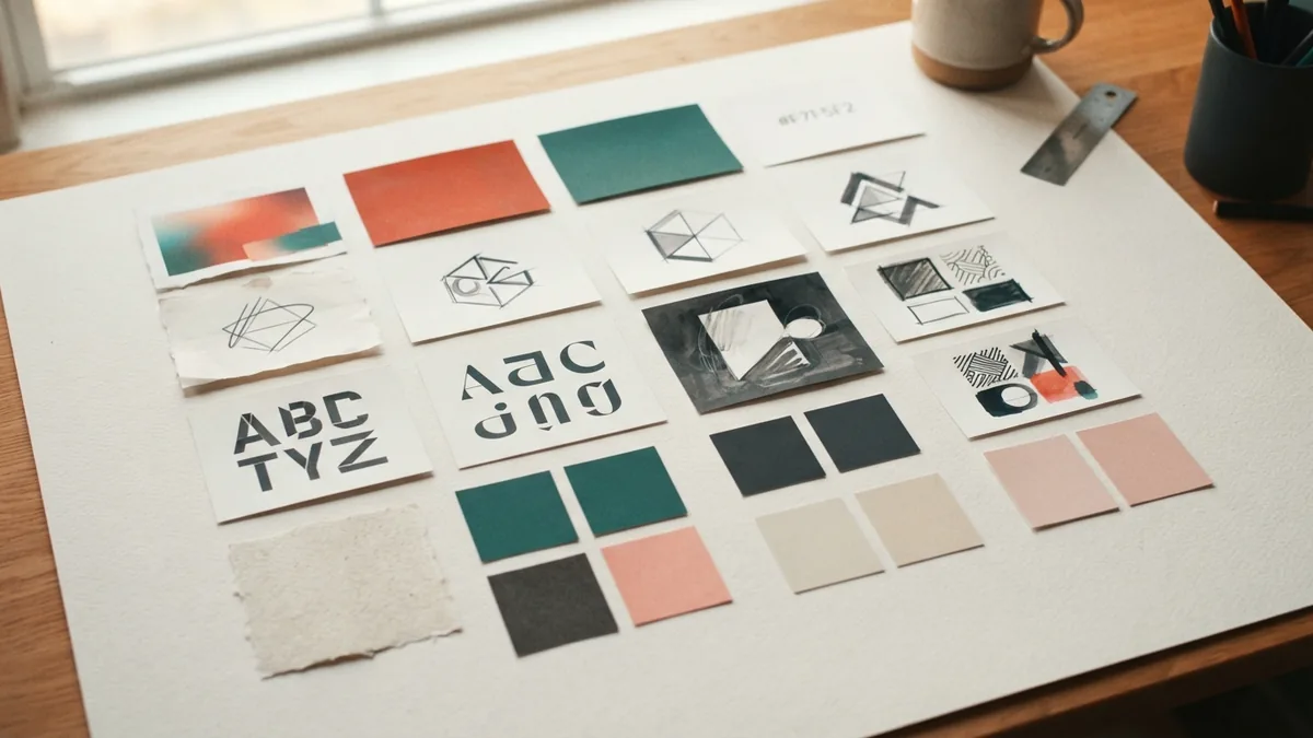
Branding guidelines explain how to use your identity in real work. They help staff, freelancers, and partners make sound choices without asking about every post. A short guide with clear examples often beats a long file full of broad claims. Make it easy to scan and simple to update.
To learn how to make branding guidelines, gather your choices about audience, offer, visuals, and voice. Show the right way and the wrong way for key tasks. For example, show the safe space around a logo and a case where it sits too close to other art. Examples make rules easier to follow.
- State your purpose. Name your audience, offer, values, and main point in plain words.
- Show logo use. Include approved versions, minimum size, clear space, and backgrounds to avoid.
- List colors and type. Give color codes and font names, with examples of headings and body copy.
- Set the voice. Describe how the brand sounds and share a sample message.
- Add channel rules. Note any changes for web, print, social posts, and email.
- Name an owner. Say who can approve changes and where the latest guide lives.
To make a branding guide people use, tie each rule to a common task. If your team often makes event flyers, include a sample layout. If partners write product pages, give them approved copy to follow. Review the guide when your offer, audience, or look changes.
Build a Branding Kit for Daily Work
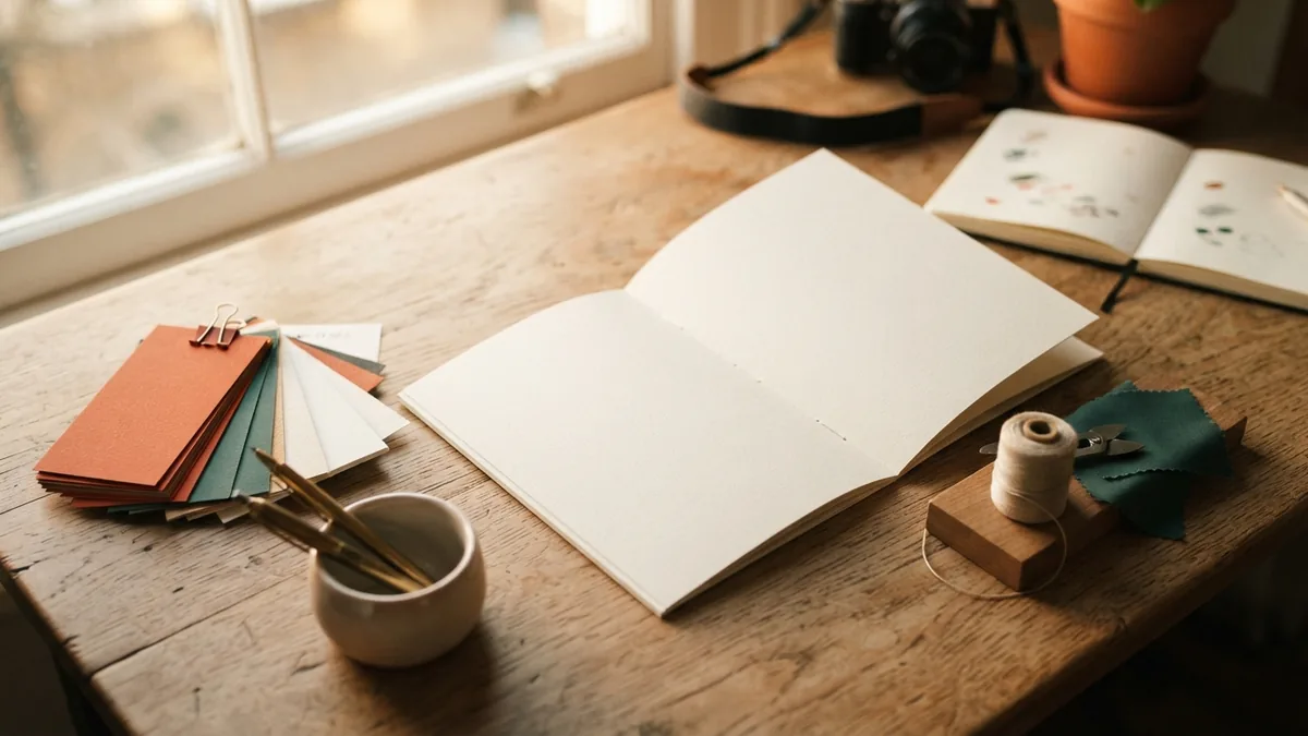
A branding kit holds ready-to-use files and notes that help people apply your identity. The guide sets the rules; the kit gives people the parts. To make a branding kit, gather approved files, name them clearly, and store them in one shared place. Keep old drafts out of the main folder.
Include logo files for common uses, color codes, font details, and approved images or icons. Add a short voice note and examples of branded work. A social profile picture, slide cover, and email signature may be useful. Choose items your team needs often.
Sort files by use, not by the name of the person who made them. Use plain names such as “logo-dark” and “logo-light.” Add the file type or intended use when it helps people choose. Make one person responsible for keeping the shared folder current.
Before sharing the kit, ask someone outside the design process to use it. Can they find the right logo and color codes without help? Do the examples answer common questions? Fix the gaps they encounter. A kit works when people can use it on a busy day.
Design a Branding Board
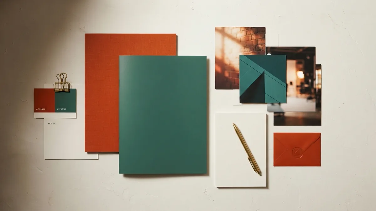
A branding board is a compact view of the main visual choices behind your brand. It helps your team see how colors, type, images, and logo styles work together. It is useful during early design work and when you brief a new partner. Think of it as a quick reference, not a replacement for full guidelines.
Start with the logo and a small set of color swatches. Add the names or samples of your chosen type styles. Include a few images that show the mood and subject matter you want. A short line about the audience or brand traits can explain why these choices fit.
Limit the board to items that help people make a choice. A crowded board can hide the core look. Show one or two examples of the identity in use, such as a product label or social post. Check that the board still makes sense when viewed on a small screen.
Keep Your Branding Consistent Across Marketing
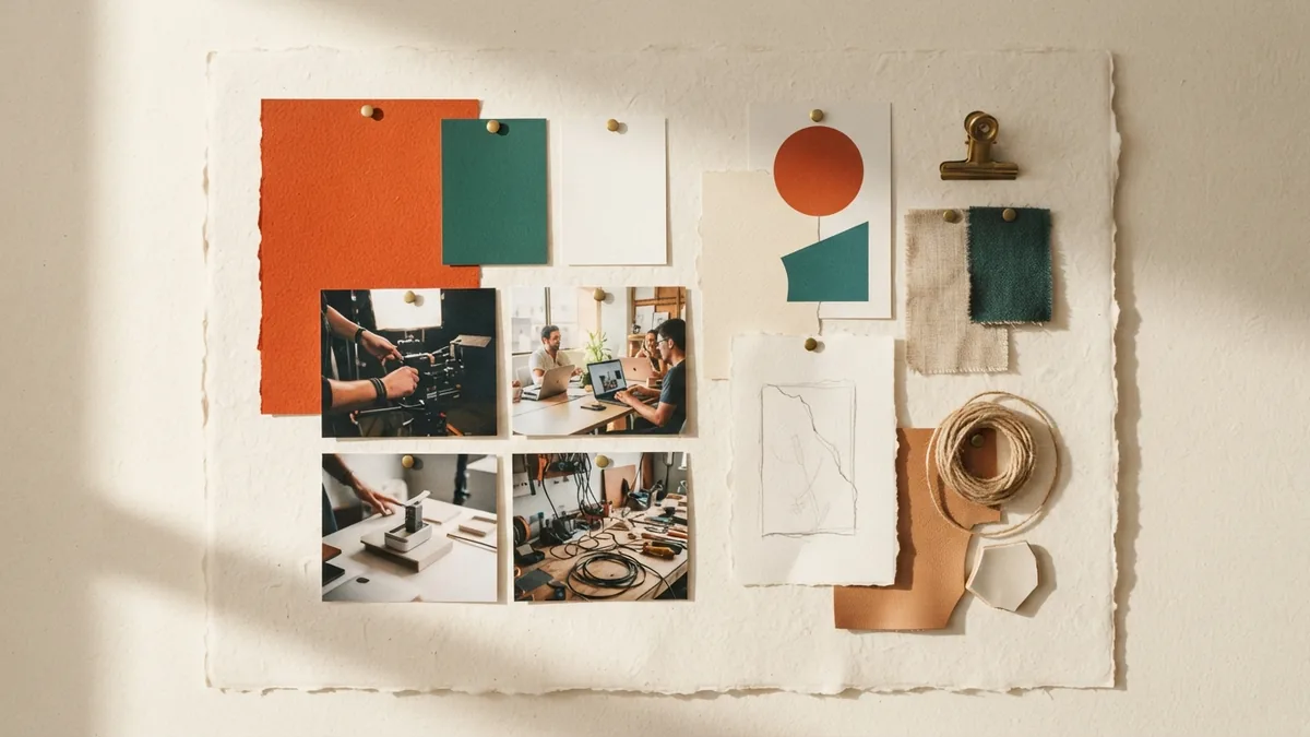
Consistency does not mean every channel must look identical. It means customers can recognize the same business through different formats. Keep your logo, colors, type, and voice aligned, then adapt the layout to each channel. A short post and a printed flyer need different space, but they should share the same core feel.
Build repeatable layouts for work your team makes often. These might include email headers, sales sheets, social posts, or event signs. Add approved examples to your kit, and give each layout a clear use. This makes new work faster and reduces avoidable design drift.
Set a light review process for new materials. Check that the message fits your brand promise, text is easy to read, and approved assets are in use. Ask one named person to make the final call. Review results with customers and staff, then update rules when the business changes.
Brand equity grows through repeated, useful experiences. A clear identity gives those experiences a shared shape. Keep the promise honest, make the tools easy to find, and revisit the system as your work evolves. The goal is recognition built through consistent choices.