Create a Company Logo That Fits Your Brand (Step by Step)
Plan, design, test, and set clear rules for a logo your company can use anywhere.
Why a strong logo matters
A logo gives people a quick visual cue for your company. It can help customers recognize your brand across a website, package, storefront, or social post. It is one part of brand identity, not a substitute for good service or a clear offer.
If you are asking, “How do I make a logo for my company?”, start with the job it needs to do. A useful logo reflects your company’s character and works in the places customers meet you. Aim for a design that is simple, memorable, timeless, versatile, and right for your business.
A local bakery might need a warm, handmade feel, while a software firm may want a crisp, modern look. Neither style is right for every company. The best choice comes from your audience, your offer, and the impression you want to leave.
Choose the right parts for your design
Most logos use a wordmark, a symbol, or a mix of both. A wordmark uses the company name as the main feature. A symbol can help people spot the brand quickly, while a combined mark offers both name and image.
Keep the core design easy to read at a glance. Use one or two type styles, and limit the main palette to two or three colors. Color theory can help you set a mood, but strong contrast and clear type matter more than color trends.
Check that the design still works in black and white. It should also remain clear when small, such as on a profile icon or a business card. These tests help reveal details that may look good on a large screen but fail in real use.
- Simple: Remove small details that do not help recognition.
- Memorable: Give the design one distinct feature people can recall.
- Timeless: Avoid effects that depend on a short-lived trend.
- Versatile: Prepare versions for different sizes and backgrounds.
- Appropriate: Match the tone to your offer and audience.
Move from brand research to first concepts
Before you draw, write down what your company does, who it serves, and what makes it different. Pick three traits you want people to connect with your brand. For example, a repair shop might choose “skilled,” “honest,” and “quick.”
Look at competitors to understand common patterns, not to copy them. Note their colors, shapes, and type choices. Then decide how your own design can stand apart while still making sense in your field.
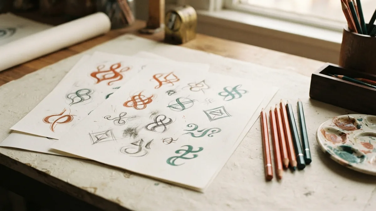
Next, gather visual references that fit your chosen traits. Sketch several rough ideas on paper before opening a design app. Try different layouts, symbols, and letter shapes. Do not spend time polishing the first sketch; make a few distinct options first.
Choose the strongest idea based on clarity and fit, not personal attachment. Ask a few likely customers what they notice first and what kind of business they think it represents. Their answers can show whether your intended message is coming through.

Build and refine the design with digital tools
Once you have a strong sketch, recreate it with an online design tool. Canva, Adobe Express, and dedicated logo makers offer templates, type choices, and simple editing features. They can help beginners make a first version without advanced design skills.
Start with a blank layout when possible. Templates can speed up the work, but many users choose the same ones. Change the type, shape, spacing, and color so the result reflects your own company. Check the tool’s terms before using its art in paid work.
Keep the design balanced. Leave enough space around the name and symbol, and check that letters do not crowd each other. Save a high-quality vector file when the tool allows it. Vector graphics can scale up or down without becoming blurry.
Save working files as well as finished versions. Export a transparent file for flexible use, and keep a high-resolution image for print. If you need a logo animation or a “how to make logo video” tutorial, treat that as a separate task. A moving version should not replace a clear, static design.
Choose a tool that lets you export the file types and sizes you need. Some free plans limit downloads or reserve certain features for paid accounts. Confirm those limits before you build your whole design around one service.

Design a logo on an Android phone
You can make a logo on Android with a phone or tablet and a suitable design app. Look for an app that lets you edit text, shapes, colors, and spacing. Useful export options matter too, especially transparent backgrounds and large image files.
Begin with a simple layout that fits your screen. Add the company name, then test a small number of type and symbol choices. Use pinch zoom to inspect fine details, but check the full design at normal size before you settle on it.
Save a copy after each major change. If the app supports vector export, use it for a design that must scale cleanly. Otherwise, export a large image and keep the original project file in case you need to edit it later.
Phone screens can make colors look brighter or type look sharper than they do elsewhere. Review your design on another screen, then print a small sample if you plan to use it on paper. This simple check can catch problems before launch.
Set clear rules for logo use
Logo guidelines explain how people should use your design. They help staff, printers, and outside partners keep the brand consistent. A short guide is useful even for a small company with only a few people.
Show the approved versions and explain where each one belongs. Include the main color design, a black version, and a white version for dark backgrounds. State the smallest size that stays readable, and set a clear area around the mark.
Good rules also prevent common mistakes. Tell users not to stretch, rotate, recolor, or add effects to the design. Include the right file for web and print work, along with contact details for questions if needed.
Keep the guide short enough that people will use it. A single page can cover the core rules; a larger company may need examples for packaging, social posts, and signs. Update it when the design or approved files change.
- List approved color and one-color versions.
- Show minimum size and clear space.
- Name the correct file type for common uses.
- Give examples of changes users must not make.
Test, choose, and prepare the final files
Before approving the design, view it in the settings where customers will see it. Test a website header, a small social icon, a printed sheet, and a dark background. Check both full color and black and white versions.
Ask a small group of people in your target audience for specific feedback. Ask what they think the company does and what they notice first. Avoid asking only whether they like it; that question gives little direction for useful changes.
Make final edits based on clear problems, such as hard-to-read type or a symbol that looks like a competitor’s. Then save the approved master file and export the versions you need. Keep file names clear, such as “brand-primary-color” and “brand-white.”
Review the files before sharing them. Open each export, check its background and size, and make sure the colors match your guide. A well-tested design is easier to use and less likely to cause avoidable rework.
- Write down your audience, offer, and three brand traits.
- Study competitors, then sketch several distinct ideas on paper.
- Build the strongest concept in a design tool and refine it.
- Test the design at small and large sizes, in color and black and white.
- Set usage rules, save master files, and export approved versions.