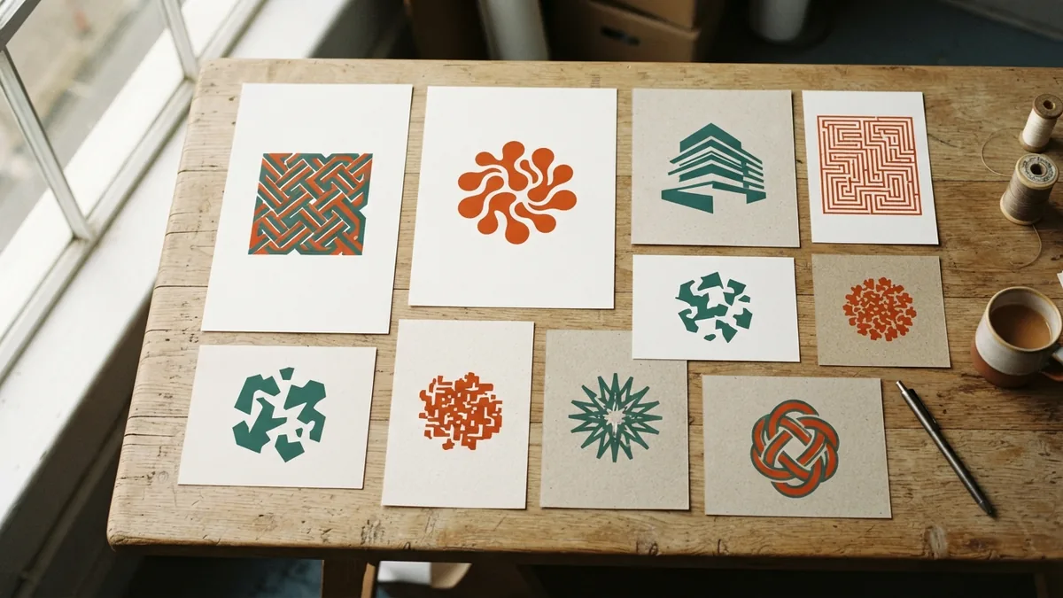
What Makes a Good Company Logo?
Build a logo that feels right, reads clearly, and works at every size.
Essential Features of a Good Logo
A company logo is often the first visual sign people notice. It can shape their view of a business before they learn what it offers. A strong mark helps people spot and recall the company. It is a key part of brand identity, not just decoration.
So, what makes a good company logo? It needs a clear purpose and a look that fits the business. It should speak to the people the company hopes to reach. It does not need to show every service or tell the whole company story. A few well-chosen forms can say more than a crowded design.
Good logo design rests on four core traits: simplicity, memorability, scalability, and versatility. Each trait supports the others. A mark may look striking on a large sign but fail as a small icon. It must work wherever customers see it.
- Clear: Its main form reads at a glance.
- Distinct: It stands apart from similar firms.
- Flexible: It works across sizes and formats.
- Relevant: Its look fits the company and audience.
A polished mark can still fail if it feels wrong for the company. Judge it by how well it serves the brand. Detail alone is not a sign of good design. Strong branding starts with a mark people can use and recognize.
These logo design principles also help with web design. A mark may appear on a site header, a small browser tab, or a phone screen. The same core shape should remain clear in each place. A good web page design gives that mark room to work.
The Importance of Simplicity
People may see a logo on a phone, sign, or moving van. They often have only a moment to take it in. A clean shape and clear focus help the design register fast. That makes simplicity a sound place to start.
Remove parts that add no meaning or aid recall. Limit the number of shapes, and avoid fine details that vanish when small. Pick type that stays easy to read. Test the mark in black and white before you settle on its colors.
Simple does not mean dull. A distinct letter shape, useful symbol, or bold color pair can give a spare design character. Each part should earn its place. If removing a detail makes the mark clearer, leave it out.
Complex designs can work in some fields. A family crest, seal, or detailed badge may suit a club or craft shop with a long past. Even then, keep one clear main shape. A simpler version can serve small spaces.
Try the design in one color before adding effects. If its main form disappears without a shadow or gradient, it may rely too much on polish. A strong logo holds together on its own.
Make the Logo Easy to Remember
A memorable logo gives people one clear idea to recall. It may use a bold shape, a distinct letter, or a small cue linked to the business. The cue should feel natural. It should not need a long explanation.
Novelty matters less than fit. A playful mark may suit a toy shop, while a calm style may fit a law firm. Neither look works for every audience. The right choice depends on what the brand should signal.
Before you sketch ideas, write down three traits the brand should convey. A local food shop might choose warmth, freshness, and care. Use those traits to guide shape, type, and color. Then ask people in the target audience what the design suggests.
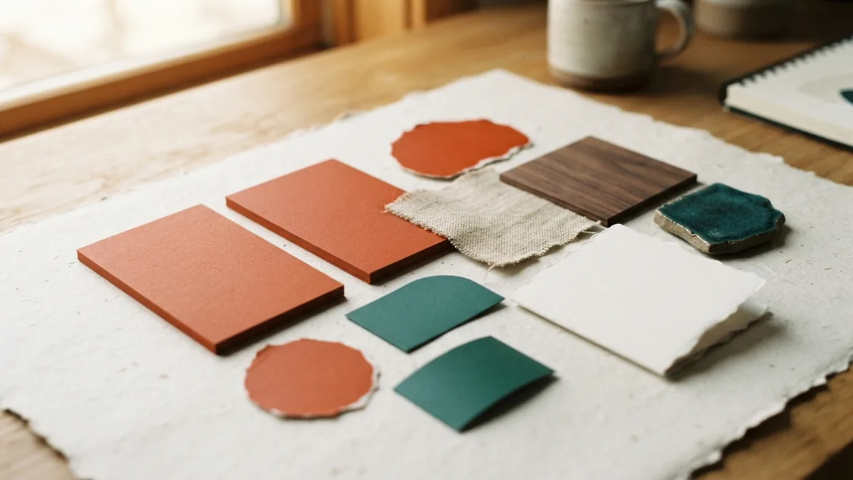
Color can shape mood, but it has no fixed meaning for everyone. Culture and context affect how people read it. Check that the palette fits the brand and stands apart from nearby rivals. The logo should still work without color.
Recognition grows through steady use. Keep the core mark consistent across signs, packaging, and online channels. Change it only for a clear reason, such as poor legibility or a shift in the business. Frequent redesigns can weaken recall.
That consistency supports effective branding. A logo helps people link a business to its products and service. It cannot replace a sound marketing strategy, but it can make each message easier to recognize. The mark should back up the same promise across every channel.
Versatility and Scalability
A scalable logo stays clear from a tiny app icon to a large shop sign. Thin lines and small gaps may vanish when the design shrinks. Test it at the smallest size it will need in real use. If key parts blur, simplify them.
Many brands need more than one logo version. A wide layout may fit a site header, while a compact symbol may suit a profile icon. These forms should share key visual cues. That link helps people connect them to one brand.
Check the mark on both light and dark backgrounds. Keep a one-color version for simple print jobs, stamps, or etched goods. Make sure it works in print and digital formats. Different uses may call for different file types.
Vector files can grow or shrink without losing sharpness. Keep a clear set of approved versions and color choices. This helps staff and print partners use the mark as intended. It also cuts down on off-brand edits.
Versatile logo usage does not mean forcing one layout into every space. Plan a small set of related forms instead. Each form should remain easy to link to the main brand. Good file names and a short use guide can help teams pick the right version.
How to Reflect Brand Identity
A logo should reflect what the company stands for and how it wants to be seen. Start with its values, audience, and place in the market. A mark for a high-end service may need a different tone than one for a friendly neighborhood shop. The look should feel true to the business.
Write down the brand traits before choosing shapes or type. Keep the list short, and rank the traits by importance. For example, a repair shop might want to signal skill, trust, and speed. Those words give the design team a useful test for each idea.
Ask whether the design feels right to the intended audience. Show it without explaining the concept first. Ask what kind of business they expect and what feeling the mark brings to mind. Their answers can reveal gaps between the plan and the design.
Good branding needs more than a logo. The mark should work with the company name, tone, colors, and customer experience. A mismatch can weaken trust. A clear, steady identity can help people know what to expect.
Common Mistakes in Logo Design
One common mistake is trying to fit too many ideas into one mark. A logo cannot tell the whole company story. Choose one clear point to express, then let other brand tools add detail. This keeps the mark easy to read.
Copying a rival's look can also cause trouble. A familiar style may seem safe, but it can make the business hard to tell apart. Study the visual patterns in your field, then find a distinct route. Distinct does not have to mean strange.
Do not judge a logo only on a large screen. Review it at small sizes, in one color, and against varied backgrounds. Check how it looks on real items, such as a package or sign. These tests catch flaws that a polished mockup can hide.
Finally, avoid changing the mark without a clear need. Fix issues that harm legibility or no longer fit the business. Keep the parts that customers already know. A good brand logo is clear, useful, and easy to recognize over time.