What Is Web Design? (Core Ideas and Key Terms)
See how web design joins layout, content, and function to help people use a site.
What Is Web Design?
What is web design? It is the work of planning and making websites. It brings together layout, content, and graphic design to help people use a site.
Web design shapes what visitors see and how they move through a page. Designers set the structure, choose type and color, and decide which details matter most. Developers then build the design with code or a content system.
The meaning of web design goes beyond looks. A useful site helps people learn, compare options, or finish a task. Each page needs a clear goal and a sense of its audience.
A service site might show its offer, proof, and contact details on one page. A shop needs clear product facts and a simple way to buy. These are web design examples shaped by different goals.
Web interface design covers the parts people use, such as menus, buttons, and forms. Strong interface design makes those parts easy to spot and use. The result should feel clear on both a phone and a computer.
Key Components of Web Design
User interface (UI) design covers the controls people use. User experience (UX) looks at the full visit. It asks whether people can reach a goal without needless effort.
Color theory helps a team choose colors that work well together. Typography is the choice and use of type. Clear headings and readable body text help visitors scan a page.
Visual hierarchy is the order in which page parts catch the eye. A strong heading, short intro, and clear call to action can guide visitors. A CTA (call to action) asks them to take a next step.
Padding is the space between an element's content and its edge. Enough padding can make a button easier to read and tap. Alignment also matters. It keeps page parts in a clear order.
Accessibility means making a site usable by people with varied needs and tools. Use readable contrast, clear form labels, and keyboard-friendly controls. These choices help more people use the site.
- UI: Menus, links, buttons, and forms
- UX: How easy it is to reach a goal
- Visual style: Color, type, spacing, and page order
- Accessibility: Design that supports more people
Understanding Wireframes and Layouts
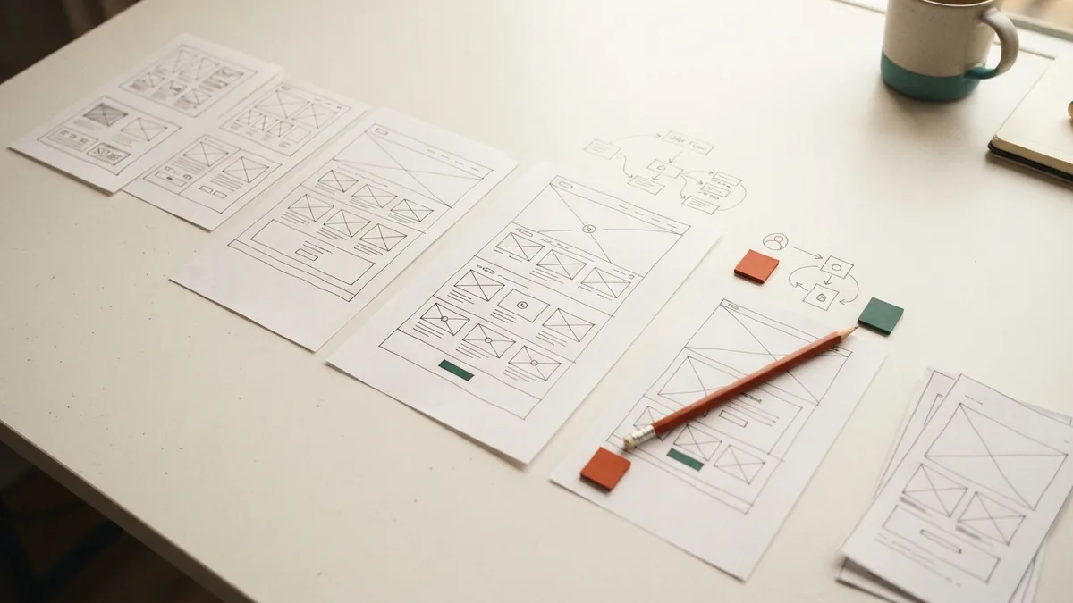
What is a wireframe in web design? It is a basic visual plan for a page. It shows where key parts may sit before the final look is set.
A service page wireframe might place a heading at the top. Below it, the plan could show a short summary, proof points, and a contact form. This lets a team check the page flow before adding fine detail.
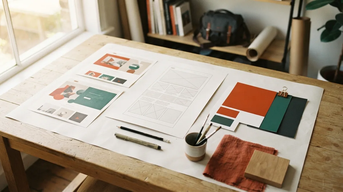
A mockup adds visual detail, such as color, type, and sample images. A storyboard can map the steps in a task. These tools help teams find gaps before a site is built.
A sitemap shows how pages relate to each other. It helps teams plan navigation and group related content. Breadcrumbs show visitors where they are within that structure. They also offer a path back to broader pages.
Start with the page goal and the facts visitors need. Sketch the order of sections and actions. Then ask people who know the audience to review the plan.
- Write down the page goal.
- List the facts and actions visitors need.
- Sketch the page sections in order.
- Review the flow and revise it before styling.
The Role of CSS in Web Design
What is CSS in web design? CSS means Cascading Style Sheets. It is a language that sets the look of web pages.
CSS can control layout, color, type, and spacing. HTML marks up page content, while CSS shapes much of its visual style. Together, they form a core part of many websites.
A breakpoint is a screen width where a layout rule changes. Breakpoints help a page shift when its current layout no longer fits. There is no single standard screen size for web design.
Responsive design uses flexible layouts that adjust as the screen changes. Adaptive web design often uses set layouts for chosen screen sizes. The difference is how each approach handles changing screens.
Test pages at many widths, from small phones to large screens. Check that text stays readable and controls remain easy to use. The MDN guide to CSS explains the language and its features.
Web Design Terms: Hero, Accordion, and Eyebrow
A hero is the large, eye-catching area near the top of a page. It often holds the main heading, a short pitch, an image, or a clear action. A hero image should support the page message, not crowd out useful details.
An eyebrow is a short label above a heading. It can name a service, topic, or audience before the main message. Keep it brief so the heading stays in focus.
An accordion lets visitors expand and collapse sections of content. It often suits FAQs or long pages with several related topics. Use clear labels, so visitors know what each section contains.
These terms describe common design choices, not rules for every page. A hero should suit the page goal, and an accordion should make content easier to scan. Use each feature only when it helps visitors.
How to Choose a Web Design Company
Start by checking the company's portfolio. Look for work that serves goals like yours, not just pages that look stylish. See whether its past sites are clear, quick to use, and easy to read on phones.
Ask how the team plans a project. A good process should cover goals, audience, page structure, design review, and testing. Ask who will write content and who will handle updates after launch.
Share your business goals before you discuss features. Ask for a clear scope, timeline, and list of included work. Compare proposals by what they deliver, not by price alone.
Also ask how the team will measure success. A shop may care about completed orders, while a service firm may value good leads. The right company should link design choices to those aims.
WordPress and Adaptive Web Design
WordPress is a popular content management system (CMS). It lets teams publish and manage site content without editing every page by hand. Themes set much of a site's look, while plugins add features.
WordPress web design can use a ready-made theme or a custom build. A theme can speed up a basic site. A custom design gives more control over layout and brand details.
Adaptive design aims to make sites work across devices and screen sizes. Teams may create layouts for a few screen ranges and serve the one that best fits. Test each layout with real content, not just empty sample boxes.
Whether a site uses WordPress, custom code, or both, the core aim stays the same. Make the content easy to find and the next step clear. Good design joins a strong plan with careful testing.