Create a Logo That Fits Your Company and Brand
Build a logo that fits your brand and works wherever customers see it.
Understand what a logo needs to do
If you ask, “How can I create a logo for my company?” begin with its job. A logo helps people spot and recall your business. It does not need to show every product, service, or value at once.
A logo is one part of a brand. Your brand also includes your values, voice, service, and customer experience. The logo gives people a visual cue, but it cannot create trust on its own.
Plan for real uses from the start. Your logo may appear on a website, sign, social profile, package, or invoice. It should stay clear when small and work in color and black and white.
Think about how the mark will look across those settings. A detailed drawing might look fine on a large sign, then turn to a blur on a phone screen. Simple forms tend to hold up better.
Define your brand identity
Write down what your company does, who it serves, and what makes it distinct. Choose three traits you want people to feel, such as bold, calm, or welcoming. These traits can guide your shape, color, and type choices.
Turn those traits into a short design brief. A local repair shop might want to seem skilled, honest, and quick. A soft script font may not fit that promise. A sturdy, simple typeface could work better.
Ask what customers should recall after seeing the mark for a few seconds. Keep the answer brief. It will help you judge ideas later, rather than picking a design just because it looks stylish.
People often ask, “What is the difference between logo and brand?” The logo is a visual mark; the brand is the full set of ideas and experiences people link to your business. Make the logo fit that wider identity.
Research your market and competitors
Look at 10 to 15 businesses in your field, including local firms and larger names. Note common colors, shapes, and font styles. This competitor analysis can show useful patterns and crowded design choices.
Make a simple chart with each competitor’s name and visual cues. Mark what feels distinctive and what looks alike. Then choose one or two ways your logo can stand apart while still making sense to customers.
Do not trace a rival’s mark or use a lookalike symbol. Search for similar marks in your region and business category before you settle on a design. The USPTO trademark search tools help people find marks in the United States. Check the relevant trademark office if you sell elsewhere.
This early check can save time and money. It does not replace legal advice, but it can flag a design that deserves a closer look. Keep your own sketches and notes as you work.

Sketch several logo ideas
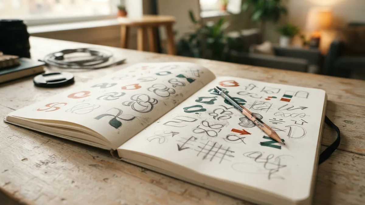
Start with rough sketches, not a polished digital design. Try at least 10 small ideas with different layouts and symbols. Quick sketches let you explore more options before you spend time on one direction.
Test a wordmark, a symbol, and a mix of both. A wordmark uses the company name as its main feature. A symbol can help in small spaces, but a new business may need its name beside it.
Keep each sketch simple enough to draw from memory. Remove details that vanish when the mark shrinks. Circle three strong ideas, then redraw each with cleaner shapes and spacing.
Ask someone unfamiliar with the sketches what they notice first. If they read the name wrong or see an unintended shape, revise the idea. This is a quick way to catch problems before digitizing.
Choose colors and fonts with care
Color psychology can shape how people read a logo, but color meanings are not fixed rules. Blue may feel steady to some viewers, while orange can feel lively. Culture, context, and the rest of the design affect the message.
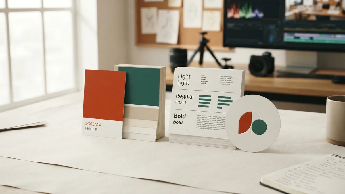
Choose one main color, then add one or two supporting colors. Check that the logo still works in black and white. This test matters for stamps, low-cost printing, and settings without color.
Pick a font that fits your brand and stays easy to read. Test the company name at small sizes and from a short distance. Avoid thin strokes or tight spacing if they make the name hard to scan.
Limit the logo to one or two typefaces. If you use a paid font, check its license for business use. Note the font name and color values so future designs match.
Choose design tools and file types
Canva and online logo makers can help you build a simple first draft. They work well for quick layouts and basic brand assets. Check the terms for any icons, templates, or fonts you use.
Adobe Illustrator is made for vector graphics. Vector files use paths, so they can grow or shrink without turning blurry. If you hire a designer, ask for an editable vector file and ready-to-use exports.
Keep the design process focused. Make a few versions of your strongest sketch rather than changing everything at once. Save dated drafts and note why you kept or rejected each change.
Prepare a core set of logo formats: an editable vector file, a transparent PNG, and an SVG for supported digital uses. Ask your printer which file types it needs. One image file rarely fits every job.
If you need to show the mark in motion, make a short logo video after the design is set. Use a simple reveal that keeps the logo clear. Do not add effects that change its shape or colors.
Finalize, test, and prepare your logo
Test your leading design at several sizes and on real backgrounds. Try a phone screen, a business card, and a sign mockup. Check whether the name and key shapes remain clear in each setting.
Gather feedback from a few likely customers and key stakeholders. Ask what they notice first, what they think the company does, and whether anything feels hard to read. Ask for clear observations, not a vote on personal taste.
Use that feedback to make focused changes. Test the revised mark again in color, black and white, and at small sizes. A logo that works only on a white screen is not ready.
Write a short logo guideline for future use. Include approved colors, typefaces, file formats, and examples of clear space around the mark. Add rules for minimum size and backgrounds, too.
Keep a final folder with the source file and common exports. Give each file a clear name, such as “logo-black.svg” or “logo-white.png.” This makes it easier for staff and vendors to use the right version.
If you wonder how to create the best logo for your brand, focus on fit, clarity, and repeat use. The best choice is not always the most complex one. It is the mark that reflects your company and stays useful across real settings.